Creating a WordPress Website Navigation for User Experience and Conversions
You can’t reach your destination without knowing where you’re going. Your navigation bar is like the road map for your website. Today you see plenty of creative and interesting navigation bars, but are they actually effective? Or are they simply confusing visitors?
Navigation is one of the most important yet commonly overlooked aspects of your website. Navigation is commonly left to the very end, or isn’t given more than a second of thought. However, you need a navigation bar that strikes the perfect balance between user experience and optimizing website conversions.
Your website’s navigation bar will help your visitors find what they’re looking for (without overwhelming them), and will also work to achieve the goals you’ve set out for your website. Your navigation bar is much more than a simple category listing.
Below we show you how you can improve your navigation bar by focusing on the user experience and designing it in a way that also improves your sign up rates and other conversion metrics.
1. Nail Down Your Information Architecture
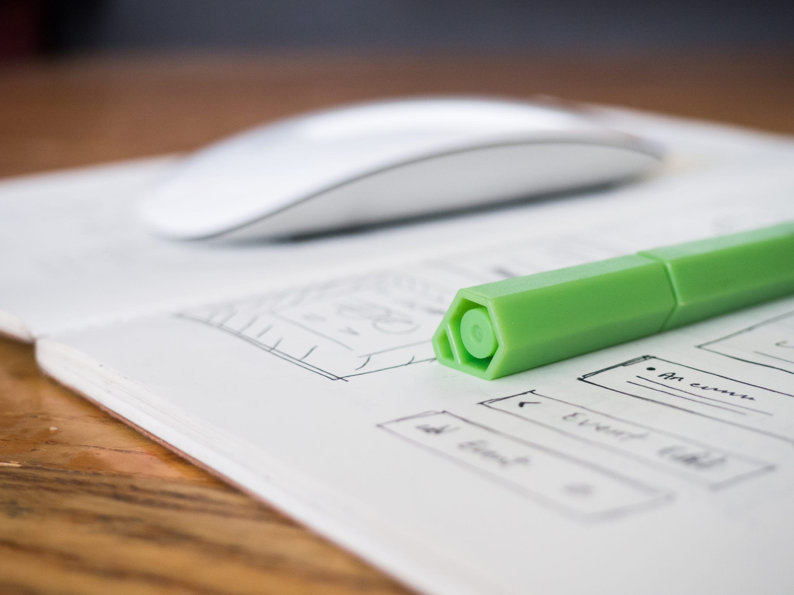 Photo via: Jeffrey Betts
The overall structure of your navigation bar is going to be based upon your website’s content. By having an understanding of how the content on your website is going to be laid out and flow together you’ll be able to create a navigation bar that supports the usability of your site.
Your internal architecture is essentially a table of contents for your website. It allows you to see every page of your website before you begin tying all of them together.
If you’re in the process of creating your site’s internal architecture, or you’re redesigning your website, it can be helpful to ask yourself the following questions:
- What pages will my website need to have?
- What is the goal for each page?
- Do each of these pages make sense in the overall scheme of my site?
- What pages are the focal point of the website?
- Which pages are the most important in terms of business growth? i.e. subscriber pages, store, products page, etc.
- Are there any pages that’ll be expanded in the future? i.e. your blog page, faq section, case studies, etc.
2. Keep Your Navigation Simple
Overwhelming your visitor with navigation options will only reduce website conversions and create a less than pleasant website experience overall. Your goal should be to keep your navigation bar as simple as possible.
If your site has a lot of content, then make sure you structure it in a way that feels simple. A lot of websites do this by using nested and drop-down navigation and even creating separate navigation bars for different pages of the site.
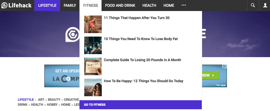
Lifehack uses drop down navigation to help make it easier to access the volumes of content across their site.
But be careful… having too many drop-down options can also be confusing to your visitor. So make sure that your drop down options make sense when grouped together.
Limit the Number of Items
It’s a common practice to limit the total number of website navigation options to seven. Why? Because short-term memory can only hold seven items at a given time. Plus, any more than seven simply looks too big and messy! Remember, your goal is to provide a comfortable and useable website, not one that makes them scamper for the back button.
Short term memory can only hold seven things at a time, so keep your nav bar to seven items or less.[/tweetthis]
Plus, if you’re currently executing any SEO campaigns, then chances are a lot of your links will be pointing to your home page. In order to make the most of the links, you don’t want to dilute your “link juice” too much. Instead, have your navigation bar filled with your most important pages that you’d like to see an increase in rankings.
3. Stay Within Convention (Creativity Can Kill Conversions)
Trying to be too “creative” with your site’s navigation can actually kill your conversions and make it much more difficult for your visitor to use your site.

For instance, the most common navigation menu placement is horizontally along the top of your website (like we’ve done at Mode Effect).
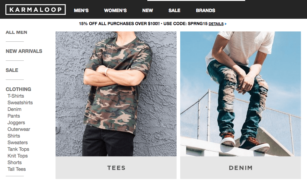
However, the vertical navigation bar does make sense is some cases and can commonly be found across eCommerce websites. Karma Loop utilizes both horizontal and vertical navigation.
Make sure the navigation layout your choosing is in line with viewer expectations. Being creative and differentiating yourself from the competition is important, but not when it comes to the navigation bar.
Another recent development in navigation bar presentation is having a hidden navigation bar. This will usually show up as three distinct lines, shown below:

The Olympics Story website utilizes the expansive three lines navigation bar.
This is a fairly new addition to the presentation of navigation bars, so it’s a little early to make predictions regarding the overall effectiveness. This display might make sense for smaller screens, but could look out of place when it comes to larger screens.
You’ll have to experiment until you find your sweet spot. Just make sure you’re not compromising the experience of your user for the sake of having a “cool looking” website.
4. Always be Testing
 Photo via: Raymond Sam
Are you sure you know which pages of your website your users find the most valuable?
We’re big fans of testing every element of our websites. It’s nearly impossible to correctly guess and build the perfect website the first go-around — your navigation bar is no different.
When it comes to optimizing conversions you’ll want to utilize the data your customers provide you. Some of the most common elements to test are highlighted below:
- The phrasing of your navigation options
- The order of your navigation menu
- The font size and color options
If you have an analytics solution installed, then you’ll be able to determine which pages your customers find the most valuable.
When analyzing your data keep in mind that you’ll want to optimize around the pages that your paying customers use the most. For example, your pricing, case studies, and products pages might get less traffic overall it’s probably a good idea to feature these pages instead of burying them if you want your revenue to increase.
Creating a navigation bar that strikes the perfect balance between usability and conversions will take constant testing while staying in line with best practices. By following the tips above you’ll be well on you way towards creating a navigation bar that easily achieves both.
What are your favorite navigation bar tweaks? Please share in the comments below.