4 eCommerce Design Trends that Amplify Results on Your Store
UPDATED 1/17/17 Video post included | Subscribe to us on YouTube.
eCommerce website design is a fast-changing landscape. At Mode Effect, we specialize in designing eCommerce websites on the WordPress WooCommerce platform, which we’ll talk a bit more about later.
To help keep you up-to-date on the latest trends that have a powerful impact on an eCommerce store and its success, we’ve rounded up four design trends to incorporate into an eCommerce site. Each will have an impact on your customer’s first impression, how they engage with the site, whether they make a purchase or not and if they become repeat and loyal customers.
Card-Like Layouts & Material Design
Material Design is being adopted rapidly by eCommerce sites. Codenamed Quantum Paper, Material Design is a design language developed in 2014 by Google that expands upon the “card” motifs debuted in Google Now. It makes more liberal use of grid-based layouts, responsive animations and transitions, padding, and depth effects such as lighting and shadows. Material Design is a lively, content-focused design style that allows a website to have a consistent, fun and engaging experience across multiple devices and platforms. It is an ideal style for eCommerce sites, whose goal is to create a tangible and impactful user experience.
Card website layouts – think Pinterest with its card-like format – continue to be hot and allow for an easy experience for users to browse products on a site. Cards are a main component used in Material Design. Using a card design allows for organizing products and categories into a pleasing, simple-to-navigate framework. Best of all, a card-like layout works well in multi-device landscape and is easily made responsive.
Both card designs and material design have been shown to lower bounce rates and increase the stickiness factor, whereby users stay on a site longer to browse and buy. ASOS and LOFT are examples of a card-like design.
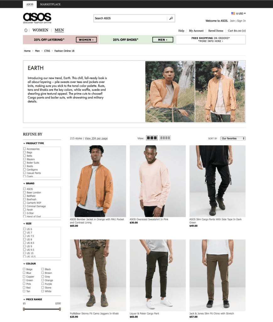
ASOS.com – Card design layout
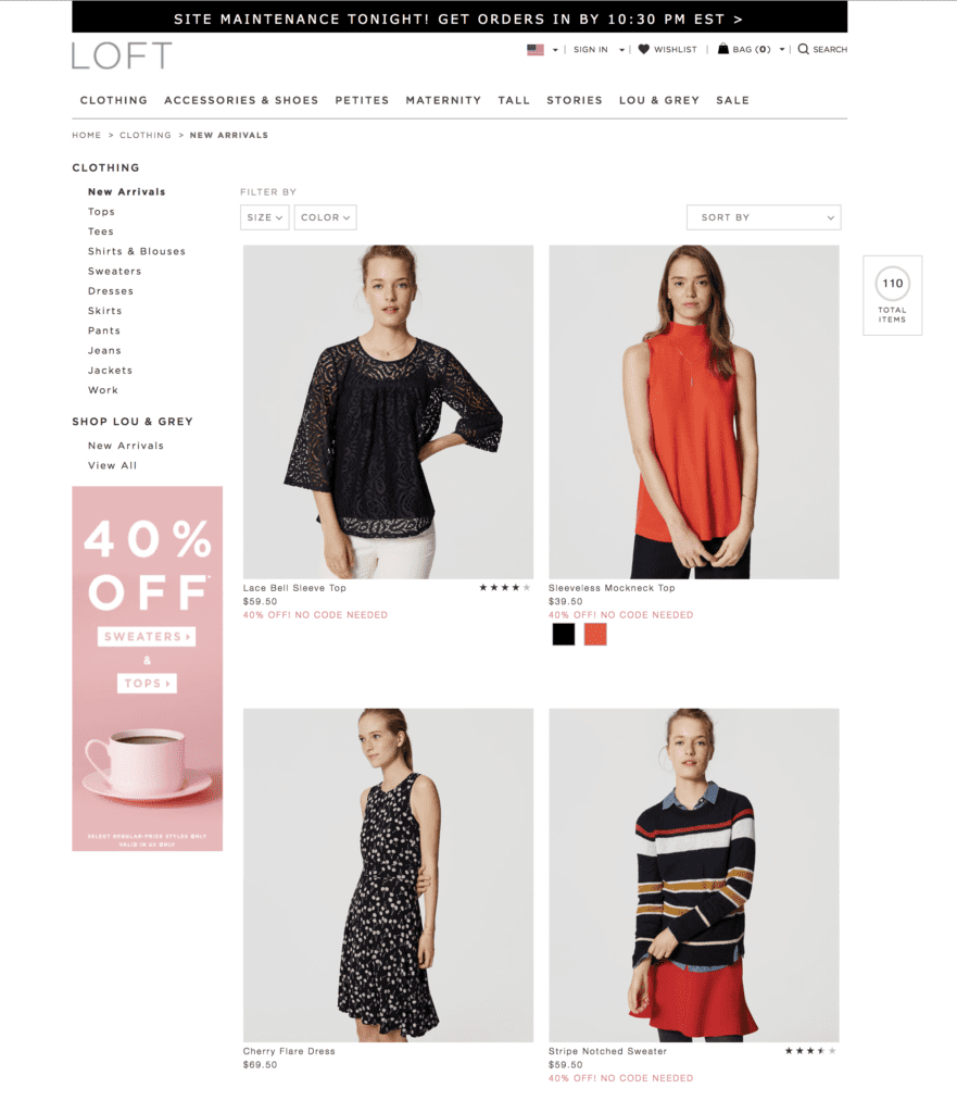
LOFT – Card based layout
Large Backgrounds
Studies show that when customers encounter a large and unique image on a website, they stop and take notice. Large backgrounds, essentially big attractive headers, came early in the revolution of website design and have continued to be a mainstay. They are used extensively on eCommerce sites for good reason – the provide a clean, fresh experience and present products in a way that makes users want to purchase them.
Often called the “Hero Image,” your homepage background plays an important role in telling your brand’s story (more on the role of storytelling in a moment…). Your image should be relevant to your brand and underscore its tone and speak to its target market. A carefully selected background image can help to recreate a “brick and mortar” shopping experience for visitors. While large images should definitely be part of the homepage design, they can also be used effectively on product pages as well.
On trend eyeglass seller Warby Parker uses several large images on its homepage that align with its brand. Everlane, a direct to consumer luxury brand, in comparison uses one main image that takes up nearly all of its homepage real estate.
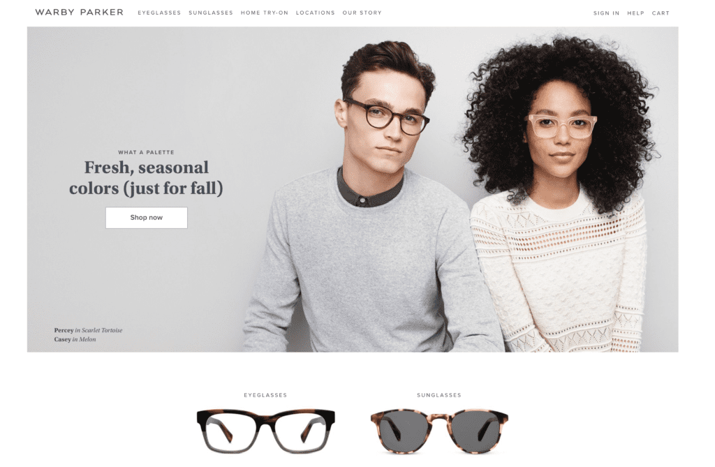
Warby Parker – Homepage
[content_upgrade cu_id=”2916″]Get the bonus content: 5 E-Commerce Design Considerations That You Should Have on Your To-Do List[content_upgrade_button]Click Here[/content_upgrade_button][/content_upgrade]
Storytelling
Storytelling has always been the most effective form of marketing, and it should definitely be part of your eCommerce site. A good brand story will separate your brand from the pack. Using Material Design and card layouts along with large backgrounds play a role in storytelling. A good story brings a brand to life. It creates an emotional connection with customers and increase loyalty and sales.
We came across this amazing example of brand storytelling via video from the brand Backcountry on Ometria’s blog. An Ometria notes in the blog, the video focuses on the brand’s root, share its values, uses examples to create an immersive experience and sells the experience – all tenets of good brand storytelling.
GREATS, a footwear brand that makes high quality products sold direct to the consumer at a value price, leverages video and large imagery on its About Us page.
Long Scroll
Finally, the long scroll has become the norm for website design, as users are accustomed to scrolling rather than clicking on mobile and tablet devices. Think of using this design tool to help tell your story. Through the use of large images, hero images, video and compelling text, you can take your customers on a journey into your brand and its products.
FeedProjects.com, founded by Lauren Bush in 2007, provides meals with every handbag purchase to those in hunger and poverty. The company’s website clearly tells it story along with featuring its unique products as you scroll through the site.
Platforms for eCommerce – The Benefits of WooCommerce
 There are a number of different platforms out there for building an eCommerce website on. As a website development company that specializes in building WordPress websites and WordPress enterprise sites, it was natural for us to select WooCommerce. WooCommerce is a WordPress product that has quickly become the leading platform for eCommerce websites.
In fact, WooCommerce currently supports 30 percent of all online storefronts, the majority of Internet stores. By selecting WooCommerce, you can be sure to receive the same level of benefits and quality as you do with other WordPress products.
Bringing it All Together
It requires careful strategy when designing an eCommerce website to incorporate the key eCommerce design trends featured in this article. But, it’s well worth the effort, as it will affect how your customers engage with your site and whether they decide to make a purchase from it or not as well as if they decided to return and become repeat customers.

[…] should be professional and connect emotionally to your brand and its products. For product images, a card website layout design is a modern way to showcase products on eCommerce sites and is popular with customers. This card […]
[…] 4 Design Trends that Amplify Results on Your eCommerce Store […]
Large background images for the banners have a great impact on the sales. As per my personal experience, i can say that the banner images which shows the flash sales and offers generates a lot of sales.
[…] 4 Design Trends that Amplify Results on Your WooCommerce Store […]
[…] Summit 2017 L.A. (Sept. 18-20) Mode Effect 5 Ways to Convert More Users on Your WooCommerce Store 4 eCommerce Design Trends that Amplify Results on Your Store WooCommerce WooCommerce Developers Conference 2017 Seattle (Oct. 19 & 20) The Red Headed […]