5 Ways to Convert More Users on Your WooCommerce Store
Your homepage is a window into your WooCommerce store. If a user lands on your product page in search obviously that’s your only shot to win them over (in most cases). But likely if someone sees an advertisement or searches for your company name they’re going to land on your homepage.
So what does your website need to do? Convert users on your homepage of course! We’ll look at 5 different ways your store can cause users to convert on your homepage below.
Make it Emotional
Whether you’re designing your site for the first time or re-designing consider this question: “What are my customer’s needs?” When designing your ecommerce homepage, the page must speak to your target customer on an emotional level.
Use imagery – think big hero header images! – to connect along with compelling content. But don’t just guess what your customers are thinking, use data from Google Analytics and heatmaps to see what they are doing on the homepage and where they are clicking to from the homepage. Let the data inform the design and content of your ecommerce homepage.
A great tool to consider with your store is Crazy Egg. They allow you to truly see where users are clicking. You could also consider Sumo Me as an option while they allow you to see how far users browse on each page and where they tend to abandon your pages.
[content_upgrade cu_id="2840"]Get the bonus content: 5 Ways to Help You Decide Whether a Redesign or Optimization is the Smarter Choice for Your eCommerce Store[content_upgrade_button]Click Here[/content_upgrade_button][/content_upgrade]
Personalize It
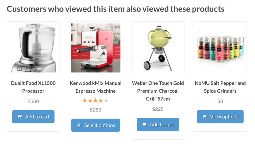
Studies show that websites with personalized content can increase sales by 7.8 percent. Sites like Amazon, famous for its personalization, see conversion rates of 13 percent. So, how can a small eCommerce storefront be like Amazon? It’s actually pretty simple with the right tools –WooCommerce’s Recommendation Engine can configure Amazon style product suggestions for your customers.

Recommendation Engine from WooCommerce
The plugin automatically recommends products to users based on view history, purchase history and products that are frequently purchased together. You can take this even further if you encourage your users to opt-in or register after making purchases. Remember it’s not just about getting users to make one purchase, you want to create a loyal customer!
Make it Searchable
An ever-present on site search feature is an underrated factor in your ecommerce site’s success. A prominent search feature – always visible even when visitors scroll – can lead to higher conversions on average. Additionally, shoppers who use the search feature are typically further down the conversion/sales funnel than other visitors.
The first step is to make sure you have prominent search functionality on your site. From there, you can add more sophisticated ecommerce search functionality like keyword-triggered banners and product highlighting.
You can consider using WooCommerce’s popular search extension to enhance the on-site search on your store. Check it out here.
Add a Popup
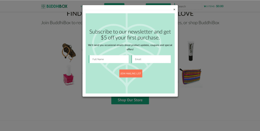
Popups can drive us all crazy, but they can also be effective. Once you’ve built your ideal ecommerce homepage, add a well-designed pop up to it. Data shows that an effective lightbox popup can increase your email marketing subscriptions ten-fold. A much used and proven strategy is to reward your new subscribers with a discount or coupon code to use on their first purchase if they sign up to receive your news.

A company making good use of this is: Bhuddi Box
When designing your pop up, be sure to follow some pop-up design practices that will ensure it’s effective, not annoying. You can also consider using the popular Splash Popup for WooCommerce here.Bhuddi Box
A/B Test Products
With limited real estate on your homepage to showcase your products, you’ll want to showcase only your most popular items. But if your store is fairly new it’s hard to know which products to showcase ahead of others. To determine which products to display, use A/B testing on your homepage and throughout your WooCommerce site.
You can always consider an off-site service to set up your AB tests such as Google Content Experiments (inside Google Analytics) or a plugin such as Convert Experiments by Yoast.
Summary
We hope you found these tips on how to optimize your eCommerce homepage for conversions helpful. Ecommerce website design is always changing, and eCommerce owners must stay on top of the trends to keep their sites fresh and engaging for their users. Luckily, when you use an eCommerce platform like WooCommerce, it makes it pretty easy to do so with access to a wide variety of tools to keep your eCommerce storefront shiny and new.
Here at Mode Effect, we build eCommerce websites on the WooCommerce platform and would love to help you improve and grow your online store. Contact us if you today for a free consultation.
Need help with your WooCommerce store?
Your leading experts in WooCommerce at Mode Effect are here to help.

[…] Free Google Webinar Replay Content & Commerce Summit 2017 L.A. (Sept. 18-20) Mode Effect 5 Ways to Convert More Users on Your WooCommerce Store 4 eCommerce Design Trends that Amplify Results on Your Store WooCommerce WooCommerce Developers […]