
3 Simple Design Tweaks to Help Your WooCommerce Store Gain a Competitive Advantage
Creating an e-commerce store that stands out from the competition is not a task to be taken lightly. As what is now the most popular e-commerce platform on the web, WooCommerce powers over 30% of online stores and has over 11 million downloads.
That’s a lot of potential competition for consumer dollars, wouldn’t you agree?
In years past, it was enough to simply be online—a presence was all that was required to generate sales. Unfortunately, the e-commerce environment is no longer that easy. It has become a business where you must look for every possible advantage, no matter the size, if you want to stand out and generate sales.
The good news is that even with all the competition, there are some common mistakes and oversights that many e-commerce retailers continue to make. More often than not, it’s the small little details the can make a difference. And, in a business where low single digit conversions are the norm, every little edge can make a big difference.
So, we’ve pulled together three simple design tweaks that might help your WooCommerce store gain a competitive advantage. But first, let’s get a handle on why these tweaks are really important.
[content_upgrade cu_id=”2751″]Want five simple changes you can make to increase your e-commerce conversions? Grab this free resource.[content_upgrade_button]Click Here[/content_upgrade_button][/content_upgrade]
Design Tweaks, the Big Picture, and Continual Improvement
Before we jump into some specific ideas, we think it’s important to explain where design tweaks fit into the bigger picture. There are a lot of e-commerce store owners who are under the impression that there is a simple set of rules that apply to all e-commerce stores. By simply following a predefined set of rules, you’ll be able to maximize your chances for success.
While this theory can hold true in the most basic sense (everyone knows responsive design is critical, right?), it’s not necessarily the best approach to take. Here’s the problem:
Every store, every customer, and every interaction is different. There is no hard and fast way of doing things that are guaranteed to work for every store. In fact, as soon as you adopt the attitude that “this is the right way”, your progress will grind to a halt.
A much better approach to take is one where you realize that your e-commerce store is unique. What works well for a competitor might not benefit you at all. The only way you can figure out what really works is through experimentation and testing.
So, with this big picture concept in mind, let’s discuss three design tweaks that can provide a jumping-off point for your WooCommerce store. Take these ideas and mold them into your own that work exceptionally well for your particular store.
Grab Your Visitors Contact Information Early in the Process
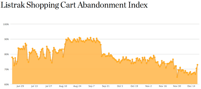
As of the time this article was written, Listrak is showing the average shopping cart abandonment rate to be 79%. That figure consistently sits between 65% and 90%, depending upon the season. Cart abandonment is a real problem that demands your attention. But how can the design of your site be tweaked to help compensate for this unnerving statistic?
One thing you can do is examine your checkout process. The method in which you sequence your checkout and how quickly you grab your visitors contact information can have a dramatic effect upon your long term marketing efforts.
When a visitor arrives on your site and fills up their shopping cart, more often than not, they’re just window shopping—checking out prices and comparing shipping costs. If they abandon their cart early in the process and leave your website, there is a good chance that they’ll never return—unless you’ve managed to capture their contact information.
There are a few ways to accomplish this objective. One idea worth considering is to capture some of your visitors information at the very beginning of the checkout process. Even if you start with just a name and email address, you’ll have opened the door to further communication.
You could also take a buyers club approach similar to Huckberry—have your visitors register to receive access to your store and special offers. Or, maybe presenting a special offer or coupon in exchange for an email address might be more appropriate.
Whatever method works better for you, the objective remains the same: Find a way to open up a channel of communication between you and your potential customers as quickly as possible.
Using Amplify Plugins Conditional Woo Checkout Field Pro plugin you can quickly grab any information you need based on a specific product the customer is purchasing.
Use Beautiful and Relevant Images
Have you had a chance to take a look at our Stinkweeds case study? If not, you might want to check it out. While it’s not an image intensive site, one important thing you’ll notice is that the images are very relevant. If you’ll excuse the pun, they reek of nostalgia. For a record store that’s 27 years old and places a huge emphasis on the local music scene, it was critical to bring as much of the in-store atmosphere and experience to the website as possible.

It goes without saying that images are not an optional component of your e-commerce store. ConversionXL put together a great post that talks about how you can use images to boost your conversion rate. Sites like Made.com,Bestmadeco.com, and even one of our own clients yurbuds.com, do an exemplary job of selling products with great images. Seriously, I challenge you to visit those sites without filling up your shopping cart.

If you spend some time looking at sites that use imagery to sell, there are some commonalities worth noting:
Professional images are a must. Good quality photographs cost more but quickly separate the amateurs from the professionals.
- Surroundings and environment are important. Are your products displayed in a context that makes sense to the end user?
- Do your images provide an appropriate amount of detail? When purchasing online, you need to compensate for the fact that your customers are relying on only one sense (sight) to make a decision.
- Use real life scenarios. By showing your products being used in a real life scenario, your visitors will be able to imagine themselves using it.
The images on your e-commerce site deserve as much attention as any other element. People shop with their senses—the more you can use that to your advantage, the further ahead of your competition you’ll be.
Communicate Your Value Proposition Quickly and Clearly
The final design tweak that we’ll propose is making sure you communicate your value proposition as quickly and clearly as possible. Too many e-commerce stores take a “me too” approach, and it leaves visitors feeling uninspired and unmotivated.
[tweetthis]The cornerstone of a successful e-commerce website lies in experimentation and testing.[/tweetthis]
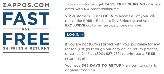
When a visitor lands on your site, you want them to know what makes your store, and your brand, different than your competitors. It could be the quality of your products or a statement about your customer service. For example, Bose frequently uses “Better Sound Through Research” to convey an image of high quality, great sounding speakers. Zappos uses “Powered by Service” to put their amazing customer service at the forefront.
Conveying your value proposition is one of the easiest design tweaks you can implement on your e-commerce site. It’s also something that you can easily experiment with in order to discover what resonates best with your visitors. Just remember, your value proposition can’t live in a bubble. It has to be backed up and reinforced by all of the other elements on your website.
Endless Design Tweaks
While we’ve covered three very specific design tweaks in this post, hopefully these ideas have got you thinking about some of the potential changes or improvements you might consider implementing on your own WooCommerce site. The possibilities are quite literally endless.
[content_upgrade cu_id=”2751″]Want some other ideas to increase e-commerce conversions? Grab this free resource.[content_upgrade_button]Click Here[/content_upgrade_button][/content_upgrade]
Just remember that any change or tweak you make has the potential to give you a competitive advantage. But, the only way you’ll know for sure is by measuring and tracking your results. Never assume that there is only one “correct” way of doing things. Different images, different value propositions, and different checkout sequences can all provide you with a leg up on your competition.
[…] expanding e-commerce market requires more from designers and site owners who want to be successful. This post from Mod Effect presents a helpful perspective on the main challenges WooCommerce stores face, and offers a […]