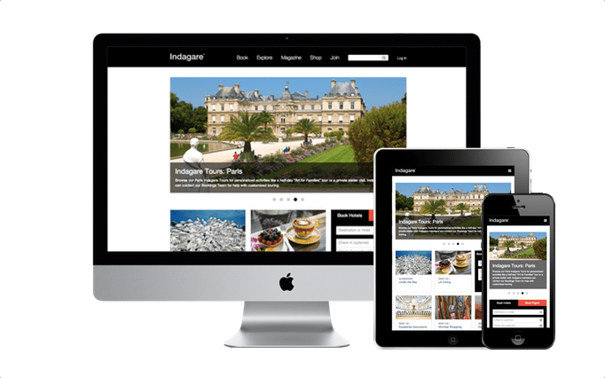
Card-Based Design: The Latest Web Trend
As more and more people begin to rely on the web for their primary source of information, the way in which this information is continuously changing. There are always new and innovative ideas coming out that will allow websites to display information in a way that is more beneficial to the user. The latest trend in this category is called Card-Based Design. Card-Based Design has become so popular that it is now being used by some of the largest websites currently on the Internet. But what exactly is it? And how can you incorporate it into your own site?
 What Is Card Based Design?
The core of card based design is the cards themselves. Cards are essentially blocks of interactive information. Just like a baseball card presents you key information in a condensed format, so does a web-based card. What separates cards from simply presenting the information inside a rectangle is that they are interactive. Most cards have ways for users to interact, whether it be moving the cards around on the page, sharing the information to their social media sites, or clicking on them to find out more information.
What Are The Benefits?
Using a card-based design for your website comes with several advantages. The first is that it almost demands interactivity from your users. Rather than simply reading the page and moving on, you are getting your viewers to interact, and therefore making them more likely to stick around or come back. Secondly, it distinguishes your site from the rest. While more companies are starting to switch to a card-based design, the vast majority have not made that shift yet. That means when someone visits your site, it is more likely to stand out among the others that they have visited.
Getting Started
To start using card-based design, you are going to have to re-think how you have made websites in the past. Using this design method requires you to structure a website in an entirely new way, and needs to be implemented from the start of the design process. You need to think about the types of blocks you are going to have on the page, their size, the color scheme, and what their functions are. For more information on designing a card-based website, you can use these guidelines from Google.
Disadvantages
While card-based design is certainly a trend that is sweeping across the web, there are some considerations to think about before using it for your website. For starters, card-based design may not be right for every site. If your site is currently very simple, and just there to provide basic information, you may not need to re-do your design. Card-based design is best when it comes to engaging users and getting them to interact. If you do not need this element, then a simple website may be best for you. Secondly, for people with existing sites, moving over to a card-based design can be a big transition. You essentially need to start from scratch for your site, and this can be a lengthy process. If your website is not a big component of your company, or if you are on a limited budget, then this design method probably does not need to be a priority for you.
Card-Based Design is a great way to revamp your website, and to get users to engage. It is for this reason that many companies are starting to make the switch over to it. Sites like Facebook, Google, Pinterest, and Twitter all use Card-Based Design to some extent, and the number of sites is growing every day. When considering Card-Based Design for your own website, think about the pros and cons, and whether or not this method would be a good fit for you. Many companies will find some advantage from using it, but it is not right for everyone.
