
Why Having Less Information on Your Website Can Improve ROI
Have you ever landed on a website only to find yourself scampering for the back button? Sadly, this happens all too often. Let’s face it, the internet is a crowded and noisy place.
If your website is confusing, loud, and overstimulating, you aren’t going to be doing your visitors any favors. Your website should exist to serve your customer, not provide the same experience as an early 2000’s MySpace page.
Creating a website dedicated to improving user experience will go a long way toward turning one-time visitors into loyal customers. Align your website with the goals of your customers and you’ll begin to improve conversion rates, thus improving the overall ROI on your website.
By taking a structured approach to maximizing your website for conversions, you can truly do less with more. In this article we’ll dive into exactly why having less information on your website can create an improved user experience and improved ROI.
1. Less Information Leads to Less Overwhelmed Visitors
Think of your website like an oasis. The moment a user lands on your website you want them to take a deep exhale and relax. No longer are they being assaulted by overstimulation. They can find exactly what they’re looking for and intuitively find their way around your site.
Sounds great, right? Well, it’s easier said than done.
The better overall experience you provide for your visitor, the more likely they are to return to your website again and spend more time browsing your site. According to a study conducted back in 2004, adding whitespace to your website will improve comprehension by 20%. This means that people will actually absorb what’s on your website, instead of combing through it with glazed over eyes.
Remember, white space doesn’t mean the additional space actually has to be white. It can be any color. Instead, white space refers to adding spacing between certain elements of your website. You can add space throughout your site by increasing the distance between paragraphs, expanding the margins to the left and right of the content, and increasing the line height.
Good usability forces you to pay attention to your customers and the experience they’re having while reading your content. If you were a customer navigating your website, how would it make you feel?
2. Less Information Forces Attention to Your Unique Value Proposition
By reducing clutter you’ll give yourself a greater chance to make your UVP (unique value proposition) stand out. Your UVP should immediately speak to and connect with your visitor. In a study conducted by Chao Lin, they found that most people will leave a website within 10 seconds of landing on the site. This means you have to grab your user’s attention as quickly as possible.
Having a clear and compelling UVP will enable your visitors to see if your site is right for them almost immediately. This means less time wasted on their end, and an increased conversion of visitors who are truly right for your business. Below we highlight a few examples of clean and concise USPs:
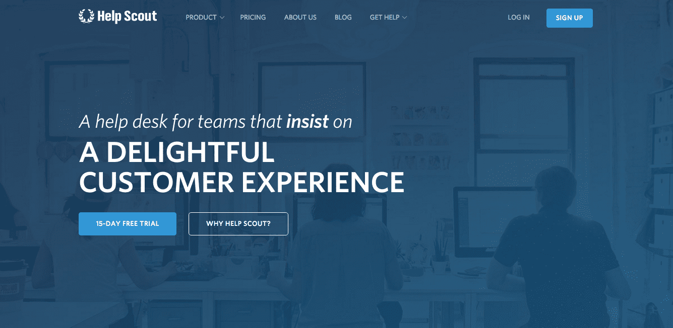 Helpscout has a clear USP that allows you to understand their business right away.
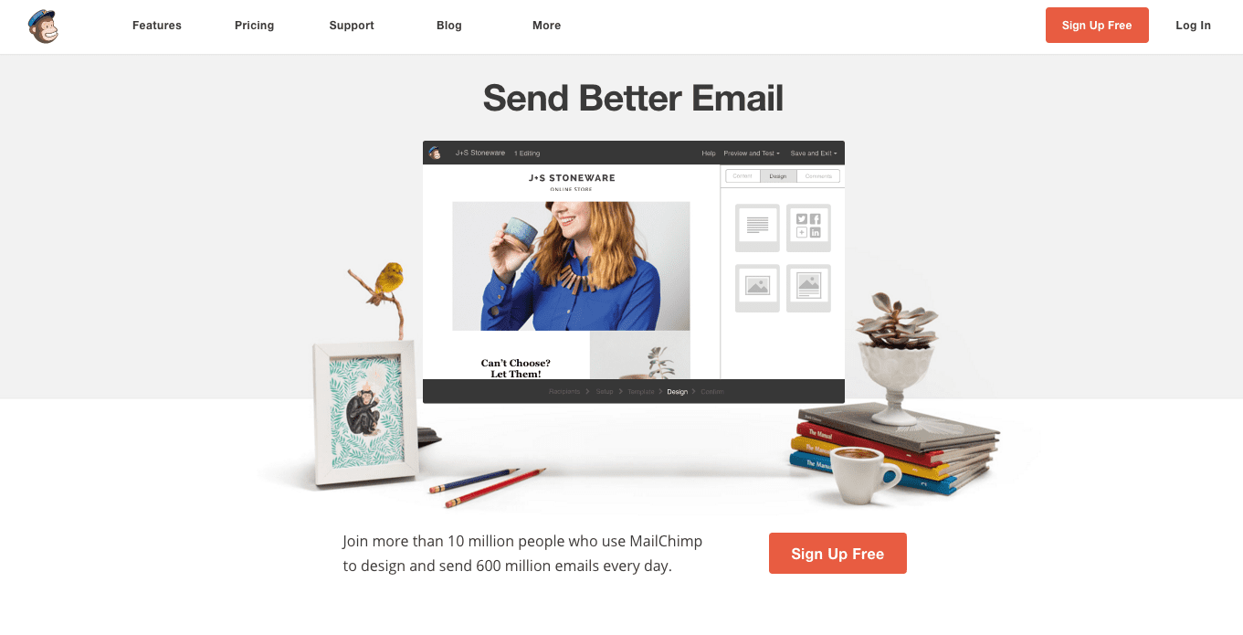 Mailchimp’s site is clean and simple. If you want to send better emails, they’re the right service for you.
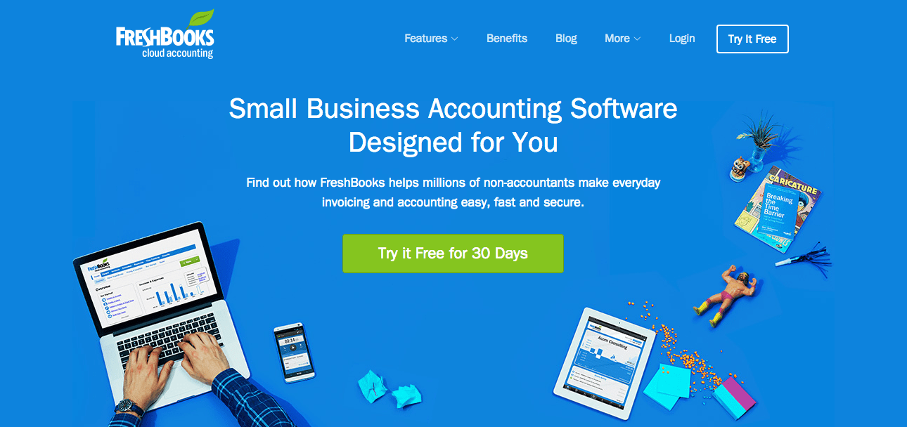 If you’re looking for Freshbooks small business accounting software, then you’re in the right place. Within seconds of landing on the site you’ll be able to determine if the company is a good fit.
As you can see, every single one of the example above does a great job of highlighting what makes them unique and they do it in the quickest manner possible. This can only be accomplished by having a non-cluttered website.
You’ll also notice they do a good job of having all the necessary information above the fold. Although, the importance of having crucial information “above the fold” is currently being debated, there’s still something to be said for allowing your customer to determine if your site is right for them within seconds.
3. Less Information Puts a Greater Focus on Your CTA
Can your users easily find your Call to Action? If the answer is no, then chances are you’re going to have an incredibly low conversion rate. A lot of websites make the mistake of burying their CTA within their content, or even having multiple CTAs, which will only dilute the visitor’s action-taking potential even further.
If your user is bombarded by ads, distracted by your drop-down navigation bar, or can’t find out how to sign up for your email list, chances are they aren’t going to stick around to find out.
[tweetthis]You have 10 seconds to grab your user’s attention. A clean design will put that time to good use.[/tweetthis]
When you set out to create a compelling CTA, make sure it stands out.
Take a look at some of the CTAs below for inspiration on creating your own:
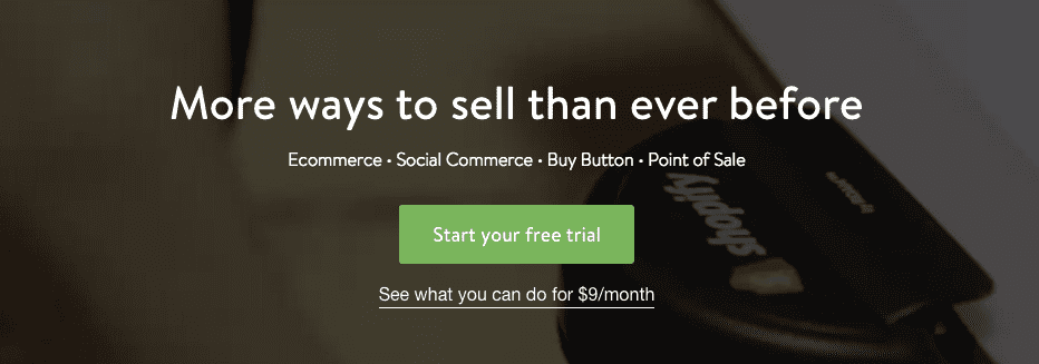 As soon as you land on Shopify’s page you can start your free-trial and begin selling your products online.
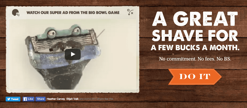 Dollar Shave Club does a great job of speaking to their target market (men who want a great shave, cheap), while offering a simple two-word CTA to inspire action-taking.
 If you’re interested in learning about Noah Kagan’s business hacks, you’ll be happy to input your email within seconds of landing on OkDork.
4. Less Information Leads to Lower Website Overhead
Are you paying exorbitant fees every single month for website hosting and maintenance? If you have a site that contains hundreds of images, videos, and other interactive elements, then chances are you’re paying more than you need to.
If you have a complex site that has a lot of interactive elements like Javascript ads, videos, sliders, and more — things will break. If you can’t fix these elements yourself, then you’re going to have to hire outside help to fix your site or pay someone a monthly retainer fee to be on call in case your site breaks at a crucial time.
When you can lower your monthly website costs, your ROI will automatically improve. Having a clean and simple site will automatically reduce your overhead. For instance, a simple site with relatively few images and a simple code base won’t break as often. Chances are, you’ll be able to keep your site up and running all by yourself.
Simple websites also a have a few other benefits that will indirectly increase your bottom-line.
Improved Loading Speed Improves User Experience
Users won’t stick around waiting for your website to load. Faster loading websites provide a better user experience simply because they don’t make your users wait. Today’s web users have an expectation that your site will load quickly, and when your site fails to live up to that expectation, you’re not creating the best impression.
To get started improving the speed of your website, you’ll need to know how it stacks up to other sites. Use a tool like Google Pagespeed Insights to see how fast your website loads currently.
Loading Speed Affects Search Engine Rankings
Google tends to prefer sites that load faster. Your site will even be penalized if it loads slowly on a mobile device. If you rely on search engine traffic to power your business, then increasing your loading speed will ensure your rankings remain intact.
You’d hate to lose the search engine rankings you’ve worked so hard for just because your website takes a few seconds too long to load.
5. Getting Too “Creative” Can Be Burdensome for Customers
Is your website cluttered because you’ve been getting “creative” with your design? By having a website that’s out of alignment with the design expectations of your user, you actually end up creating a poor user experience.
There’s a thing called cognitive fluency. Basically, this is where your brain prefers to think about things that are easy and in line with its expectations. Since most of your visitors will have spent a lot of time on the internet, they already have a set of beliefs about how a website should look.
This is why most blogs, eCommerce stores, and online magazines tend to have the same layout. It isn’t because these site owners aren’t creative, they simply understand user expectation and create their websites with those preferences in mind.
This doesn’t mean your site should be boring and resemble every other site in your niche, but you should be aware of common design standards. You should only diverge from these common principles once you have enough data to prove that it’s worth it.
Having a website that looks how it “should” will help build credibility for your brand and website. People are much more likely to work with a company they deem credible as opposed to a website that screams amateur.
Every aspect of your website should exist to serve your visitor. Having a simple website will go a long way toward enhancing several aspects of user experience. The better overall experience you create for your user, the higher your website ROI will be.
We’d love to hear about any other website owners who saw an increase in ROI by switching to a simpler design. Please share in the comments below!