Key Trends and Best Practices for Redesigning Your WooCommerce E-Commerce Website
More and more consumers are flocking to the online marketplace to sell their goods. In fact, e-commerce stores alone are responsible for generating $1.2 million in revenue every 30 seconds. Is your e-commerce store equipped to take advantage of this growing revolution?

Planning for your e-commerce re-design
Most great websites are in a constant state of redesign. Through feedback and testing they’re able to continuously engineer their websites to become more effective at serving their customers. As a store owner, you simply can’t afford not to take design seriously.
With the growing abundance of options to choose from, what’s going to make your store stand out? Since a lot of stores end up offering the same products, it’s your user experience that’s going to make your store stand out.
Below we highlight 7 different trends and best practices you’ll want to keep in mind when giving your e-commerce site an overhaul. Some relate to the actual tangible design of your site, while others focus upon certain themes to keep in the back of your mind.
Let’s jump in!
1. Usability Above All Else
[tweetthis]If your e-commerce site is clunky and confusing, users will run for the back button.[/tweetthis]
The better experience you provide your customers, the more likely they are to spend time on your website and buy from you again. During your redesign you should always have customer experience at the front of your mind.
Ask yourself, will this feature actually improve the buying or browsing experience?
Below we highlight some of the most common ways to provide a better site-wide experience:
- Keep it simple. Include ample white space between products and site features, use readable fonts, and use a color scheme that’s easy on the eyes.
- Only have a few navigation options. Make sure your navigation bar is simple and easy to use. Don’t overwhelm your user with options. Your navigation should be very intuitive.
- Have a simple checkout process. Think about how easy is it to buy something from Amazon. How can you make your checkout process more like this?
- Include a search feature that easily allows your visitors to sort through different products. Do you have a way for users to easily search for what they’re looking for? This is especially helpful if you have a lot of products for sale.
2. Tell the Story of Your Company (Bring Your Reader on a Journey)
What makes your company unique? Do you have an incredible product story? Do you believe business should be done differently?
Customers are more likely to do business with a company that either has an incredible story or shares their same common core values. But it’s not enough to just have these things, you need to communicate them in a way that brings your customer on the journey with you.
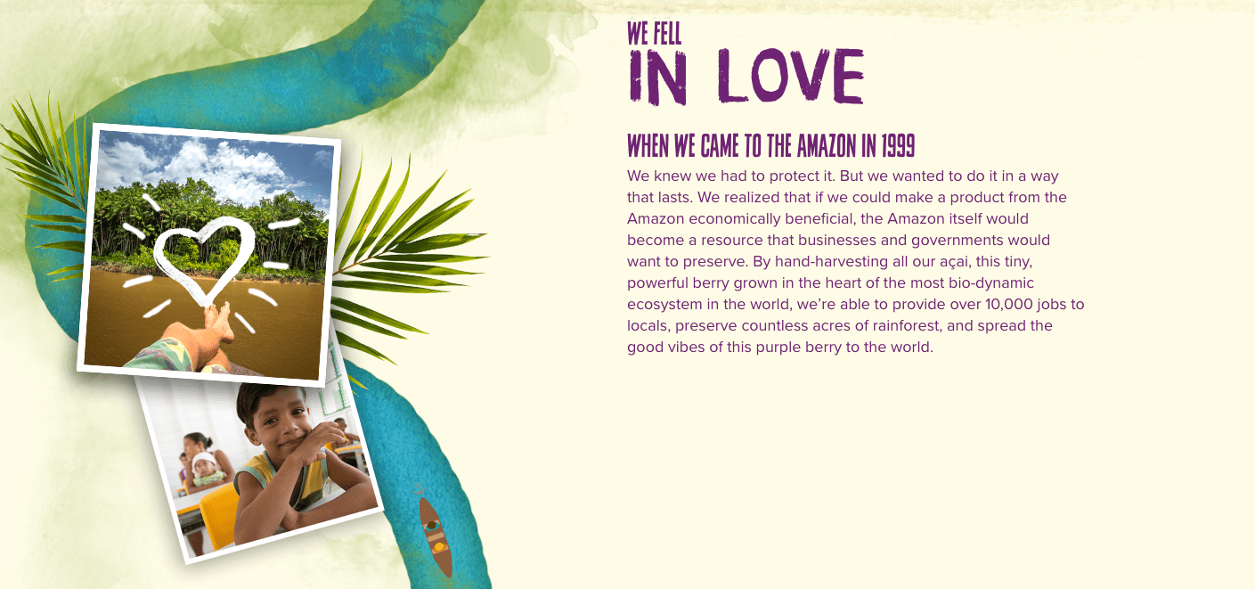 Sambazon does a great job of conveying what makes them unique by telling the story of how their company came to be. Stories like this help you to build a deeper relationship with their products.
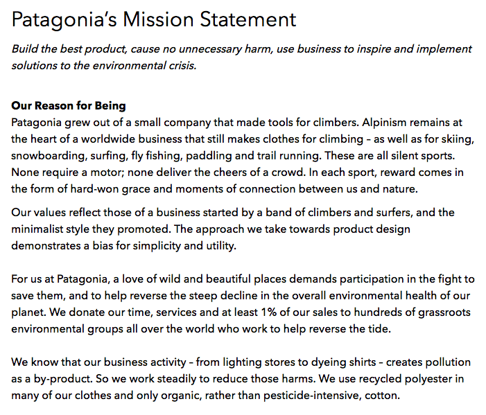
Patagonia lives and breathes their company values. A single look at their mission statement will tell you whether or not you share common values. As a result, when a customer buys something from Patagonia, they are doing more than buying an outdoor coat, they are telling the world what they believe and hold dear.
3. Think Mobile First
Mobile is the future. Some people already argue that the mobile future is already here, and they might be right. Google even announced last year that mobile traffic overtook desktop traffic in 10 countries. All trends suggest this figure is only going to increase.
When redesigning your site, it needs to look good across mobile devices. If your visitors have to constantly resize the window, or can’t read the size of your font, they aren’t going to buy. As time moves forward, the total number of screen size options are going to increase.
For this reason, we recommend going with a responsive design that looks and performs great across any screen size.
4. Don’t Have a Stagnant Site
Consumers will have dozens of different options when it comes to shopping for a similar style of product. What makes you stand out? If you’re just selling your products and not offering value in any other way, then your customers might choose to buy from one of your competitors.
If you have a stale, stagnant, and static site, you’re not doing much to continuously attract new visitors. One way to avoid this is to utilize the power of a company blog to continuously provide insanely valuable information to your readers.
But don’t think of this solely as a way to talk about your products. Instead, educate your readers on relevant issues and provide them with useful information.
5. Use Pictures That Allow Your Customers to Envision Using the Product
When shopping online your users will have a lot less to work with when it comes to your product. They only have what’s available on your site to make an educated decision. Sadly, a lot of sites still have low-quality product images (and very few of them at that).
Try to mimic the offline shopping environment as much as possible within your online store. This means including a lot of high-quality images of your product from multiple angles, as well as shots of people using your product.
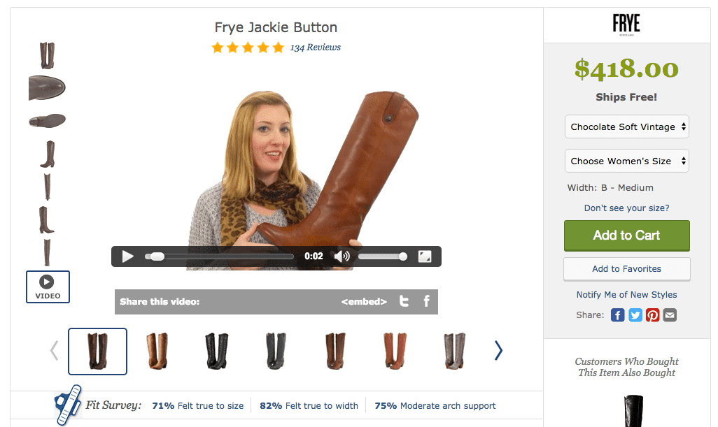
Video can also be a great addition to your product pages, allowing your viewers to build an even more intimate relationship with your products. Zappos does a great job of using videos to provide a holistic view of their products.
6. Implement Triggers to Get People to Act
One of the most important elements of your design is your call to action. Without telling people what they should do, you’re going to see your sales start to suffer. The most obvious e-commerce call to action is going to be the “Buy Now” or “Add to Cart” button.
Amplify Plugins has created a WooCommerce Quick Checkout plugin that allows users to purchase right from the product page adding a buy now button. Click “Buy Now”, the checkout opens, another purchase is made without any cart or redirect. Simple, elegant, efficient.
However, make sure these are very prominent across your storefront. In some online stores these buttons can be nearly impossible to find. By making your user actively search for the buy button, you won’t be doing your conversation rates any favors.
Testing the size, color, position, and text of your call-to-action buttons will help to create a better buying experience overall. More on this below…
7. Listen to Your Users
Do you know what your customers actually want? A lot of store owners simply make their decisions based on their own intuition. A site that’s built on guesswork will be much less effective than a site built on raw data.
That’s why we always recommend obtaining user feedback and relentlessly testing your store. Obtaining user feedback can be something as simple as emailing your subscribers a quick questionnaire, or even having a slide-up question box on your site.
Split-testing could take up an entire post, but we’ll touch on the basics here. Split-testing is essentially running two different versions of your site, with minor differences. You’ll be able to gather valuable data that will tell you which version of the site your user’s prefer.
Over time, this will help you make small changes that will improve the overall conversion rate and the experience a user has on your site.
8. (Bonus) Have Sizzling Product Descriptions
Some people absorb and process information in a more visual manner, while other prefer the written word. For this reason your product descriptions need to pop.
Your product descriptions exist to sell your product, help your user gain valuable information, and even help you rank for certain keywords. It’s a good idea to use this valuable real estate to your advantage.
A lot of sites simply leave their product descriptions blank, or use copy that doesn’t motivate the user to action. Use emotional words that convey the benefits of the product you’re selling.
Redesigning your e-commerce store isn’t an easy task, but by keeping the above points in mind you’ll be on your way towards creating a memorable storefront that sells your products and delights your customers.
What are your favorite e-commerce design trends? Share in the comments below.
Thanks, Cody! Very helpful tips and a fantastic article full with detailed points. You just won a new regular reader! – Jessica