Anatomy of a Great Ecommerce Store Checkout Page
Some time ago, we reviewed the top three reasons eCommerce shopping carts are abandoned:
- The customer was only browsing around the site
- There were issues with shipping
- The customer wanted to compare prices elsewhere or felt the price was too high
Our solutions included saving abandoned shopping carts in case a customer returns, ways to mitigate shipping cost sticker-shock, and offering instant coupons.
We also urged eCommerce businesses to make sure they provide a really great user experience so customers keep viewing and returning to the site. This article discusses the final challenge for eCommerce: how to maximize the checkout page so that buyers seal the deal.
The Checkout Page Should Look Friendly and Familiar
The checkout page is not the place to produce a “wow” factor. Instead, go for what’s familiar to online shoppers and even friendly. This is very important for first-time shoppers, who don’t need much excuse to think “this is too weird/complex” and abandon their carts.
For new customers, just ask for the basics:
- Name, billing address, email
- Shipping address if it’s different from the billing address – otherwise, auto-populate the shipping address
- Payment information
- Shipping options
If you aren’t offering free shipping for new orders (something new customers love), let customers know how much more they need to spend to get free shipping. Show a few products that are directly related to or support what they already have in their carts.
Keep the page clean and neat. It’s important to limit customer input to one page. It’s fine – and in some businesses, essential – to permit a page to review before pressing “complete purchase” but don’t make the checkout process long and cumbersome.
Many highly successful online retailers like Nordie’s and Nike have just three steps for customers before order review. They aren’t asking anything other than what is needed to process a sale:
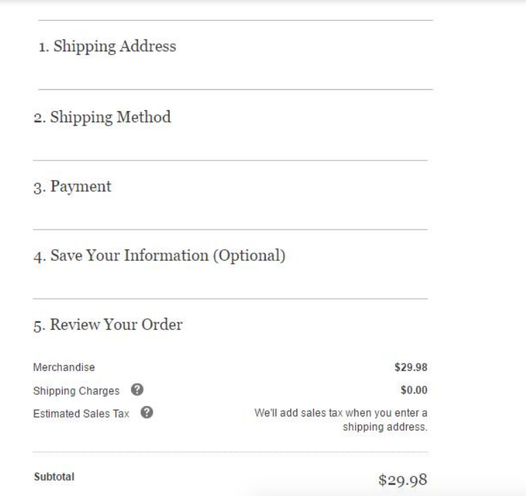
Note that they also update information like tax and shipping as the customer enters address information.
Show the Final Price, Taxes and All, Before Final Sale and Allow Cart Edits and Saving
Frequent online shoppers can usually calculate taxes and shipping charges but those who shop less often might still be surprised to see them. That’s why it’s so important to show a final payment page before concluding the sale.
The example above doesn’t list the items being purchased, which I think is useful for customers who may be working with strict budgets. While you certainly don’t want customers to buy fewer items, allowing them to edit their carts to bring costs down to a price they can afford or within a budget is certainly better than losing a sale altogether.
Save the shopping carts for customers who jump ship from the checkout page. If you already captured their email address, send an email that tells them you saved their cart. Perhaps you can encourage them back with a one-time discount or free shipping?
Allow Guest Checkout But Encourage New Accounts
It’s a bummer, but some people really don’t want to create online shopping accounts. In fact, the Baymard Institute, which studies eCommerce user experiences, found that requiring a customer to create an account was the second-most common reason people leave a site at the purchasing point, after high fees for shipping/handling/taxes. (A complicated checkout process was the #3 reason.) You must offer a guest option or risk losing business.
There are a few things you can do to encourage people to create accounts:
- Install a popup that offers to save purchasing history after checkout. Do not do this before checking out – you want a few distractions at this stage!
- If they click Yes, offer to save the payment and shipping information they just created. Voilà! A new account is created.
- For those who didn’t want to create a new account:
- Use the confirmation email to reiterate the offer to save their information. Mention your new customer discount.
- Send a thank-you email a few days after delivery and reiterate the offer. If they still don’t respond, respect their decision and don’t send any more emails.
Display All the Usual Security Seals and Credit Card Logos
Everyone is worried about security, even people who do most of their shopping online. So be sure your payment page displays Verisign or whatever security your site uses. It’s also a good idea to have the logo displayed in the page URL; most payment vendors already do this.
Also, be sure to display the logos for all electronic payments you accept.
Make it Easy for Customers to Continue Shopping Even From the Checkout Page
I can’t be the only person who hunted for a Continue Shopping button on Amazon. (FYI: It’s the home page logo.) The rest of us ought to show customers a clear path to continue shopping even from the payment page. It’s not like they will lose their place in line for checkout.
The worst thing that can happen from the checkout page is that customers will press the back button and lose all their shopping cart details, as Neil Patel notes. Make sure it’s easy for customers to find that continue shopping button!
Not a Designer? WooCommerce Check Out Page Extensions Can Help!
Because you’re using WooCommerce, you have a lot of extensions you can turn to that offer smart, fast checkout pages.
First, take a look at the checkout page that comes with WooCommerce. It’s not bad, but not particularly inviting, either. It includes 20 fields that can be a little onerous to complete, although some, like phone numbers, are optional.
- The Remove WooCommerce Features extension automates all the code needed to remove fields you don’t want to include on checkout. It’s not a bad deal at $29 for one site per year, and lets you quickly set up a checkout page.
- Multi-site owners can purchase five site licenses for $59/year and an unlimited license for $99.
The WooCommerce One Page Checkout extension was developed by the WooCommerce team. It offers several single-page checkout templates, or you can customize a template. It integrates with several other extensions that provide subscriptions and booking services, name your price options, coupons, linked products, and product bundles, and more.
- WooCommerce One Page Checkout includes templates for landing pages to use for special events like sales or new product introduction.
- If you’re comfortable designing your own page, you can do this using shortcodes or the WordPress graphical interface in visual mode. (The team is working on an interface that uses WordPress 5.0.) Both methods come with detailed step-by-step instructions.
- Subscriptions start at $79 for a single site, $129 for five sites, and $170 for up to 25 sites per year.
You can try Amplify Plugins WooCommerce Quick Checkout. This plugin offers customers the option to buy directly from the product page. Click “Buy Now”, the checkout opens, another purchase is made without any cart or redirect. Simple, elegant, efficient.
Subscriptions start at $76 for a single site per year and $229 for up to 15 sites per year.
Or you can try Bolt Checkout, another official WooCommerce extension that customizes the default checkout page far beyond the Remove option. It’s also specifically made for web and mobile users, who now dominate eCommerce shopping. The Bolt team paid particular attention to fraudulent behavior patterns, using artificial intelligence (AI) to detect suspicious patterns.
Bolt’s website says it provides the industry’s “fastest checkout experience,” with an average checkout time of 34 seconds compared to the industry average of 66. It requires fewer fields (12 compared to the industry’s 15) and uses just four clicks, compared to seven. Bolt doesn’t list its costs on its site or on the WooCommerce store, a lack of transparency I find a little troubling.
A few final thoughts:
- Make sure your site pages load quickly and make it clear when the purchase is complete.
- Give customers the option to save or download a payment summary.
- Send a thank-you email that confirms the purchase and provides a link to customer service.